![duel_logotype-1.png]](https://info.duel.tech/hs-fs/hubfs/duel_logotype-1.png?height=37&name=duel_logotype-1.png)
Additional CSS can be included in the Portal (front end) via the custom section at the bottom of the styles page. Check the app pages custom styles and insert custom CSS.
CSS knowledge is highly recommended when adding in custom styles as incorrectly implemented styles can break portals.

There are 3 sections for custom styles all relating to different areas of the portal (front end) be sure to add any custom CSS into the correct one
Hide ‘Order History’ button on R&A Module
about .channel.-referrals .channel__h1 [btn-link] {
    display: none;
}
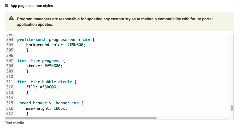
Updating progress bar colour on tier icons
tier .tier-progress {
    stroke: #f5b606;
}

tier .tier-bubble circle {
    fill: #f5b606;
}
Portal background colour
body {
  background-color: #d28dd3;
}
Background imagery on Advocate Page
Any Advocate page custom styles need to be added into the correct
body {
    background-image: url(insert image URL here);
    background-size: cover;
}
Increasing thickness on task item border
.tasks .preview > div {
  border: 10px solid;
  border-color: white;
}
Customise points text colour on task items
task-icon text {
  fill: #f5b606;
}
Different Portal Banner on Mobile
@media (max-width: 650px) {
    .brand-header > .banner-img {
        background-image: url('INSERT URL HERE');
        }
    }
New Task Icon Text Colour
pills > span.-primary {
    color: var(--badgePrimaryColor,black);
    }
Editing Overview Page Module Order
:root {
    --referralsChannelOrder: 1;
    --loyaltyChannelOrder: 2;
    --tasksChannelOrder: 3;
    }
Hide Order History Button
channel.-referrals .channel__h1 [btn-link] {
    display: none;
    }
Remove the "Tier" word from the portal header
/* Use the ::after pseudo-element on the button to cover the unwanted text */
button.tier-name.ng-star-inserted::after {
    content: ''; /* Empty content to replace the unwanted text */
    display: block;
    position: absolute;
    right: -43px; /* Adjust to cover the unwanted text */
    top: 0; /* Adjust as needed */
    width: 40px; /* Adjust width to cover the text "tier" */
    height: 1.5em; /* Adjust height to cover the text "tier" */
    background-color: #ededed; /* Match the background color to blend in
    z-index: 1; /* Ensure it covers the text */
    }