![duel_logotype-1.png]](https://info.duel.tech/hs-fs/hubfs/duel_logotype-1.png?height=37&name=duel_logotype-1.png)
🚨 If a brand is unable or prefers not to style the portal themselves, Duel can provide support. In this case, the brand must submit a mock-up of their desired portal styling, including hex codes for each design element.
Any additional customisations beyond what Duel provides will need to be handled by the brand.
Requirements:
- Access to your Duel dashboard
- A portal (front end) account to see the changes being made
To make branding edits, go to the styles section of your selected group profile in the Duel dashboard. Simply navigate to Advocates > Groups > Group Profiles > Select the appropriate profile > Styles.
From there, you can filter by variables to easily modify the appearance of the portal (front end).
- To see the changes you make, it is recommended to have another tab open and be logged into the front end. Refresh the page as you edit to instantly view the updates.
- Most of these variables are essentially CSS so it can help to have some knowledge however it's not required.
- It's highly recommended you design mobile first as this is how the majority of your advocates will access the portal.
For information on branding the Advocate pages/storefronts, as well as to see examples, please refer to the separate article dedicated to this topic.
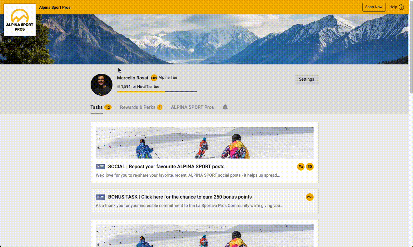
Below is a visual guide that provides a key to the various editable elements. Below you can find links with more info on how these sections are edited.

Mobile First Design
Programme Logo
Default Profile Picture
Task Banners
Task Icons
Font
Primary, Listing & Promo Badge
Portal Banner
Progress Bar
Header Background
Portal Background
Task Bubbles
Task Listing Background
Tier Progress
Tier Icons
General Listing Background
Primary Action (CTA)
Additional Portal Branding
Mobile First Design
See short animation below on how to easily display the portal (front end) as a mobile user using a chromium browser. Right Click > Inspect > Dimensions: Responsive
Primary, Listing & Promo Badges
Badges can appear on task listings and well as rewards, there are three types and they can be edited via the styles tab. See further reading on linear-gradients.

Progress Bar

Header Background

Task Bubbles

Task Listing Background
Task card styling are styled as alternative rows. The first task in the list will follow task listing styling and the second will follow task listing (alternative rows) styling.

General Listing Background
General listing include reward cards and overview tab modules. These are styled using alternative rows in the same way as tasks, see more info above.

Primary Action (CTA)
Primary Action's are displayed throughout the portal. Most common locations are the CTAs in task actions as well as CTAs on the overview tab modules.
