![duel_logotype-1.png]](https://info.duel.tech/hs-fs/hubfs/duel_logotype-1.png?height=37&name=duel_logotype-1.png)
There are three main areas of graphics required for a Duel programme, see them broken down in more detail below:
Webpage
☑️ Design Programme Landing Page
A webpage that's hosted on your e-commerce platform that provides an explanation of the programme including CTAs to the Duel hosted portal. This webpage will serve as a landing page where visitors can find information about the application requirements, potential perks and rewards, and links to the signup and login pages.
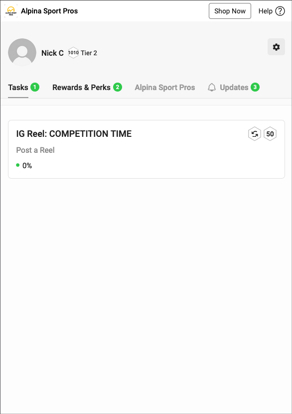
 The Portal
The portal is where advocates engage with the programme, completing tasks, and receive their rewards. It involves uploading static graphics to our dashboard and making stylistic adjustments such as fonts and hex colours.
🖌️ See a Figma file with some examples and more context on the graphic elements
☑️ Icons
Brands will have to produce the following icons, PNGs are recommended unless otherwise stated.
- Programme Logo: This can either be a custom programme logo or simply the brands logo - 400px by 400px
- Favicon: One icon 180px by 180px & One icon 32px by 32px
- Tier Icons: 400px by 400px circle cropped
- Default Profile Image: 400px by 400px circle cropped
☑️ Background Imagery & Banners
Graphics can be used on the program overview page and on the signup/login pages.
- Portal Banner Image - 1650px by 150px
- Banners should be designed to work on both desktop and mobile (helps to have repeating graphics with a central graphic)
- Signup/login page background - This can either be a graphic, solid hex colour or gradient
- If you choose to use a graphic we suggest designing it while considering different device sizes i.e mobile. 1920px by 1080px graphics that can be repeated can work well.
☑️ Portal Branding
The portal's branding can be customised through the styling page within the Duel dashboard.
There are pre-built elements that can be adjusted such as adding web fonts, changing hex colours of elements and notification bubbles
See an unstyled portal on the right-hand side as reference.
☑️ Task Branding
Tasks can be further branded with custom icons and banners. We'd recommend icons at a minimum to make it easier for advocates to navigate the task list.
- Task Icons - At least 150px by 150px transparent PNGs
- Task Banners - 1452px width, 200px height
☑️ Advocate Emails
Duel sends automated emails to advocates at key moments in their journey — from joining the programme through to reaching the top tier, plus account actions like password resets and email verification. Emails pull through your portal branding automatically (logo, fonts, hex colours) and can be further customised in the email builder.
External Graphics
☑️ CRM Emails
If CRM emails have been opted for the program, it is essential to design them to align with the branding and messaging of your brand. These emails play a crucial role in engaging participants and keeping them informed about the program. Depending on your specific brand requirements, you may need to create various email flows tailored to different stages of the program.
☑️ Promotional Graphics
Speak to the project lead on the recruitment and promotional strategies for your program and ensure they're also scheduled in. Examples of graphics needed may include, but are not limited to: